Overuse of Overlays: How to Avoid Misusing Lightboxes
After reading Kathryn Whitenton's article "Overuse of Overlays: How to Avoid Misusing Lightboxes", I began to rethink the user experience issues associated with modal overlays in web interactions. The article argues that while overlays can highlight key content, excessive or inappropriate use can frustrate users, especially when they interrupt the primary task or require them to make choices they're not prepared for. This forced interruption often undermines trust. What struck me most was the author's concept of "disrupting flow"—many designers believe overlays increase engagement, but in reality, they often disrupt user focus. Many designers add pop-ups simply to display information without considering the timing and context. In the future, I will be more cautious about when to use overlays in my designs: they should serve user goals, not branding or visual flair. Truly effective interactions shouldn't rely on forcing attention, but rather on making use feel natural, coherent, and respectful.
Best Practices for Form Design
After reading the article
"Best Practices for Form Design",
I realized that small, considered choices can significantly impact conversion rates and user trust. The article emphasizes reducing cognitive load by minimizing input fields, using single-column layouts, and grouping related items. These principles prioritize users' time and attention. I found the psychological strategies particularly compelling: asking simple questions first and demonstrating progress both boosts user motivation and reduces abandonment. Practical tips like clear formatting cues, meaningful button labels, and inline error messages reminded me that clarity and feedback are at the core of humanistic interaction design. Accessibility guidelines, appropriate contrast, screen reader labels, and avoiding solid color cues all emphasize that usable forms must be accessible to everyone, not just casual users. Implementing these best practices can transform forms from friction points into interactions that respect user needs and build trust. An example of this approach is Airbnb's signup process, which uses clear labels, concise steps, and helpful feedback to make the process feel fast and intuitive.
Visual Thinking Analysis
Reading the article “10 Intriguing Photographs to Teach Close Reading and Visual Thinking Skills” made me realize that I often just skim images instead of really looking. Visual literacy isn’t just about “understanding” what’s there—it’s about noticing details, asking questions, and figuring out what meaning the image is conveying, almost like being a detective.
For example, the Urban Jürgensen UJ‑1 watch page (https://urbanjurgensen.com/products/uj-1) does this really well. The site doesn’t just show product photos—it draws attention to the materials, movement, case curves, and hand-finishing details. I like how it combines visuals and text in a way that makes you pause and explore the craftsmanship and story behind the watch. The only downside is that some of the technical terms can feel a bit overwhelming at first.
Overall, this exercise reminded me that whether I’m looking at images or web design, slowing down, noticing details, and connecting visuals with text is key to developing visual thinking. I’ll definitely try to be more mindful about this in my own design work and when browsing other sites.
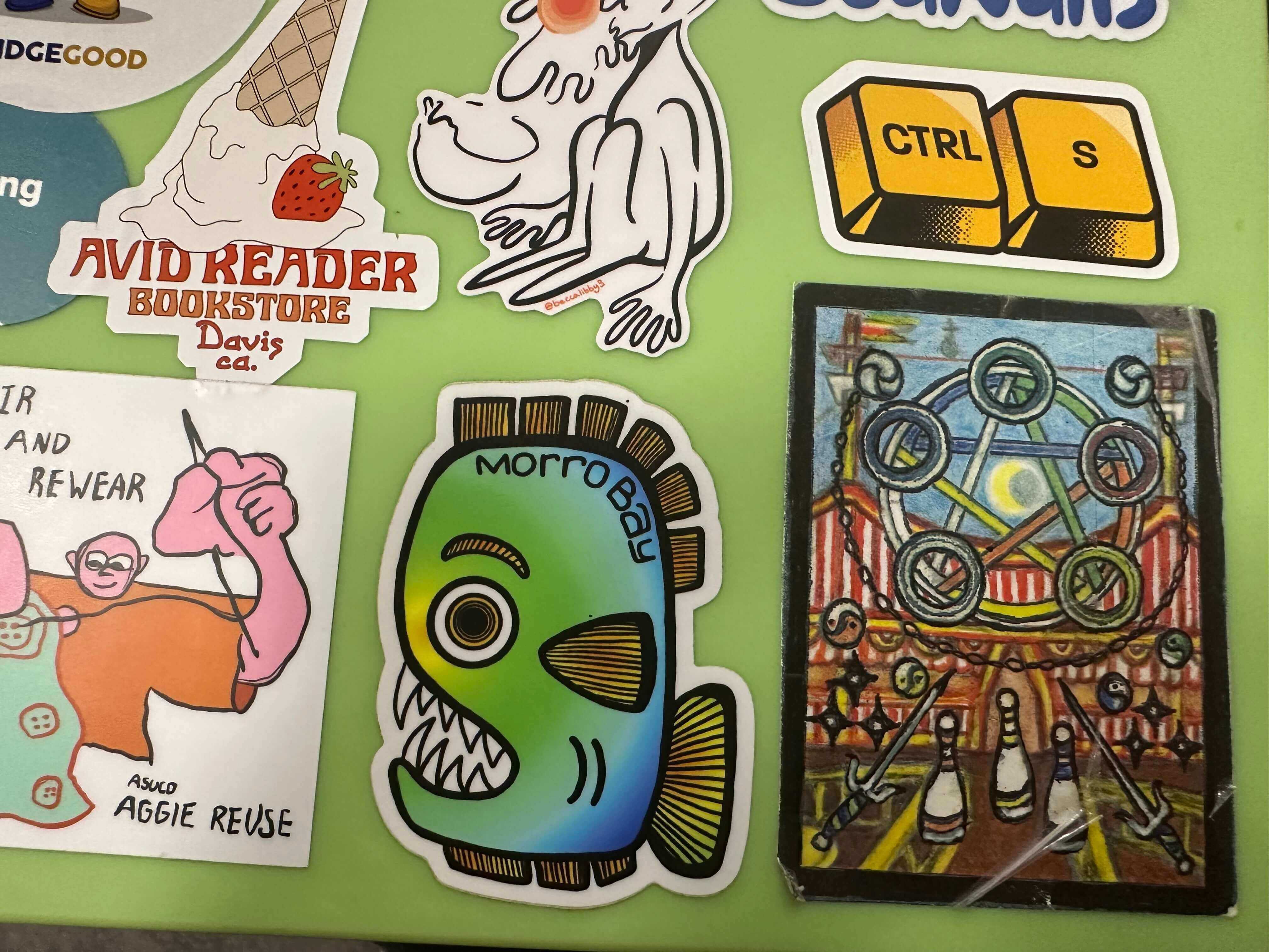
The image shows another student’s collection of stickers carefully arranged on a laptop surface. At first glance, the picture seems simple—just a group of colorful stickers—but a closer look reveals a variety of shapes, colors, and textures that create a playful and expressive composition. Each sticker has its own personality, forming a collage that reflects the collector’s taste and identity.
The most interesting visual elements are the differences among the stickers—their contrast in size, tone, and imagery. Some stickers are immediately recognizable, while others are more mysterious, leaving the viewer wondering what they represent or where they came from. This tension between familiarity and curiosity makes the image visually engaging.
If I were to suggest any improvement, I would consider changing the lighting, adjusting the composition, or photographing the stickers from a different angle. These changes could help reveal more texture and context, making it clearer that the stickers are on a laptop while also adding depth and visual intrigue.
The image showcases one of my personal collectibles: a limited-edition pair of glasses, numbered 026/300, which happens to correspond with my birthday. Beyond the immediate visual appeal, the image captures a story about the significance of this object in my life and my collection. The glasses are not merely items; they reflect craftsmanship, detail, and a sense of uniqueness that resonates with my personality.
This image is part of a larger theme in my archive, which focuses on my collection of objects that are both visually striking and thoughtfully crafted. Together, these items tell a story about my interests, aesthetic sensibilities, and appreciation for design and artisanal quality. They reveal aspects of my character that may not be apparent at first glance, such as my attention to detail and my fascination with rare or meaningful objects.
To make the image more compelling, I would experiment with lighting and atmosphere. Adjusting the light could emphasize the materials and textures of the glasses, while creating a particular mood or setting could enhance the emotional and visual impact. By carefully controlling these elements, the image would better convey not only the physical beauty of the collectible but also the personal connection and narrative behind it.
Reading “Game Design Principles” gave me a clearer sense of how much intentional structure hides behind games that feel simple or “just fun.” Even though the article is a bit corporate in tone, several ideas connected directly to our class projects. What stood out most to me is how much a game depends on clarity: clear goals, intuitive mechanics, and UI elements that let the player act without thinking. When the author describes mechanics that should feel “mindless and intuitive,” it reminded me of my own frustrations when a game feels like it’s fighting me instead of guiding me.
Another idea that stayed with me is balance. The article mentions how a game that demands “superhuman actions” drives players away, which made me rethink some of my own prototypes. Difficulty isn’t about punishing the player, but about giving them a rhythm of tension and success that feels fair. The section on feedback and sound also made me realize how often games communicate through tiny audio or visual cues that I barely notice consciously, but rely on.
Overall, the article reinforces that good design is invisible. If players feel flow, clarity, and motivation, it means the designer made a hundred decisions they’ll never see.